My (#rejected) UCLA DMA Portfolio
- AEJIN

- Mar 27, 2021
- 6 min read
Hey guys! This is the portfolio/artworks that I used when applying for the art/graphic design majors. I applied for the Design|Media Arts major at UCLA but I got rejected, BUT I also applied for Speculative Design at UCSD and got accepted. I will be attending UCI for art (they don't really have a graphic design major... but I think if I follow the visual art route I will be fine,.. akdfhakdfhalk).
Since I was never in any actual art classes and since I never made an art portfolio before, this was a fun and challenging experience. I was really used to makings things for class only; I didn't really want to use my school assignments (and also cuz they don't really want that: they want YOUR ideas and who YOU are). Also, all the other works I've done... they are just fan art or just redraws of references. I never really made anything personal for me, from my own brain. It was just a cool thing to try!
Thank you to all my friends who gave me feedback and helped me select pieces. You guys gave me a lot of confidence!
Self Portrait

AEJIN: LOVE AND TREASURE
2020
prismacolor pencils, crayola supertips, origami, quilling, tissue paper
8.00 x 10.00 x 0.50 IN
My grandparents who raised me used to buy me Yakult when I was little; I still feel stuck and bottled up as that same child. The same one that folded origami to gift to her friends, and the one who would help her grandparents pick oranges in the backyard. Slowly, I have grown to be proud of my culture. I wrap my Korean name in the bojagi because it is precious to ME. I hope that with whatever I do, whatever I make, people feel loved and treasured. Just like the name my grandparents gave me.
Word Project- Halt
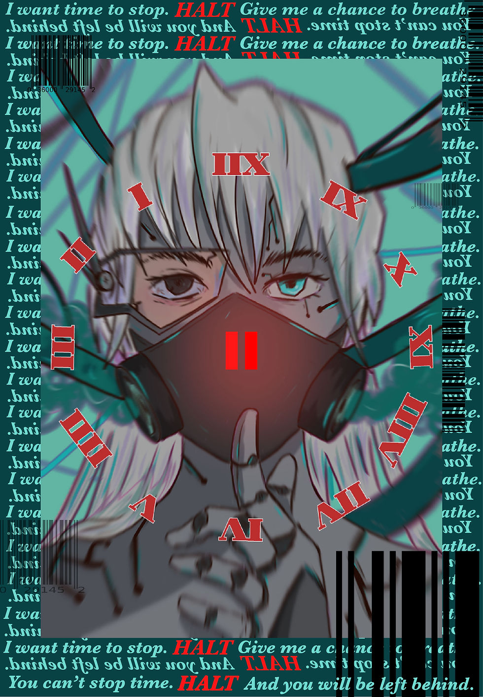
ASKING THE FUTURE TO PAUSE THE TIME
2020
Ibispaint X, Adobe Photoshop, Illustrator
832 x 1200 x 0 PX
Time isn't something that can HALT for you.
I picture this person as the embodiment of our future; we will always be asking the future to slow down or to stop, but it’s something inevitable. This is why the clock is reversed; the future watches US, through a screen, through a window. It warns us how technology will keep advancing, how commercialism may take over our lives, and how we may block ourselves from the outside... without realizing how we will be affected physically and mentally.
Unique Works

UNISEX
2020
collage; magazines
6.50 X 10.00 X 0.00 IN
I've always liked to consider myself as a tomboy. These past two years, I've been exploring more of my "girly" side: trying out nail polish, wearing more dresses, and finding jewelry. With this collage, I wanted to show the duality of both females and males; the color pink doesn't have to be constrained to one gender, and the same goes for the color black. Girls can like "edgy" things like chains, and boys can enjoy things like flowers. Gender stereotypes have always unconsciously been imposed on us at such a young age, and I feel that it prevents many people from trying new things and embracing what they enjoy. I wanted to visually show how both genders' interests can coexist with one another, and create more expression of one's self.

SCRATCH OFF
2020
Adobe photoshop
I didn't write a description for this one. For this piece, not only did I experiment with using mock-ups, I wanted to include my own photos (I'm used to just using photos online when I make edits in Computer Graphics class). I was going to do it as an actual tangible piece because I already made a scratch off thing before, but I wanted to challenge myself a bit (and also I was too lazy to paint). I wanted to show that the journey of loving yourself and growing as a person takes time. People buy these scratch off posters for movies or shows that they need to eventually watch/experience -- I feel like learning to accept your insecurities is just like... checking off a bucket list...

BOYS AIN'T SH!T... maybe except him
2020
watercolor, prismacolor pencils, Ibispaint X
6.00 X 4.50 X 0.00 IN
Having feelings for someone is WEIRDDDDDDDDD. I literally don't think I've genuinely had feelings for any guy since 8th grade.... and if I thought I did, it was more infatuation. I think it's a common thing for people to romanticize others, and to "be in love" with the mere idea of someone. For me, simple attention can get me questioning if I really like them, or if I just like being noticed.
In this watercolor piece, I wanted to show how I felt when I was talking to this one guy; he was the only one I was talking to, but I knew that he was talking to a bunch of other girls as well. I drew the male and female signs on the phones so that the "story" could work both ways (depending on how you looked at it). Crushes are childish, I know; that's why I wanted to make the background more doodle-like.

FALSE IDOL
2020
Ibispaint X
824.00 X 972.00 X 0.00 PX
I didn't write a description for this one. But this was a fan art of Taemin from his Never Gonna Dance Again album... bHABHAH I just put it in because I spent time on it and it looked cool and TECHNICALLY, I don't think you should include fan art into art portfolios... but YOLO.

WINDOW
2019 (but I think it's actually 2018)
Prismacolor Pencils, Quilled paper, and Oil Pastel
9.00 X 12.00 X 0.00 IN
I didn't write a description for this one. This was something I made for Spanish class actually bHAHAH. The assignment was to make a spin on a Spanish artist's artwork; I chose La Perla by Jose Royo. Shoutout to my friend Devin for giving me the watercolor paper for this... although I used prismacolor pencils not watercolor... anyway. I wanted to do a contrast between the beauty between life and death.

FIGURE OF A VACANT MOTHER
2020
Embroidery and Felt
4.00 X 4.00 X 0.40 IN
Just the idea/concept of a mother seems strange to me, but also somewhat sweet. I know that my mom cares about me and loves me, but there is a disconnect. Even with my stepmom, and since I've never called anyone "mom" before, it's really awkward for me to say it.
My grandmother recently lost her daughter. Watching her grieve made me reflect on my own relationship with my mom, who I really don't know. I never lived with her or really spoke to her, and the only "mother figure" in my life was my grandma.
I wanted the color red to show the shared blood the mother and a child share. I wanted it to symbolize the love that a mother has for her child, but also my own emptiness of a mother I don't have.

SEOUL TRAVEL ADVERTISEMENT
2020
I didn't write a description for this one. I wasn't sure if I could submit this but I did cuz again YOLO. They want original work / no school assignments but I was super proud of this one and I feel like it really showed my graphic design skills so. I was unsure because I used photos from the internet... but I mean everything else, I made.

YOU CAN'T KILL AN IDEA IN THE CORNER OF YOUR MIND
2020
Photography; Use of Projector
I didn't write a description for this one. I wanted to do an artwork with my projector, but also, I made that the knife and brain drawing a long time ago and I titled it You Can't Kill an Idea. The idea is that once you think of something, it's going to stay there. This can apply to creative ideas and even basic feelings. And for this one, I took a photo of my little music corner in my room; once I think of something for a song, it's going to stick with me until I get it out.
My Top 10 Influences
1) My Grandma: She reuses seemingly unusable scraps to make her own clothes or tools.
2) Percy Jackson Series: These books sparked my love for writing stories.
3) Yu-Gi-Oh! Duel Monsters: The details in manga art and plots blow my mind, and watching animations helped my imagination grow.
4) Cavetown: His covers on Youtube inspired me to make my own covers and my own music.
5) Edwin Land: His ideas forced him out of his own company; I admire his drive toward the “impossible.”


Comments